Case Study

AI-Assisted Production

Art Direction

Brand System

Color System

©2026

In-house Visual Designer

Berlin, Germany

Website

liqid.de
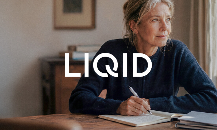
Liqid ↔ 2026 Rebrand ↔ Turning a rough concept into a system that holds.
About this project

LIQID's 2026 rebrand set out to make the brand feel more digital, elegant and premium. It began with an external agency, who delivered the overall direction: a brand concept, a set of guidelines and the foundations of a new website. From there, the in-house design team took it into production, and turning that direction into a system that worked across every format was where I came in. The colour system, the visual toolkit and the site imagery were the parts I owned.

The colour system

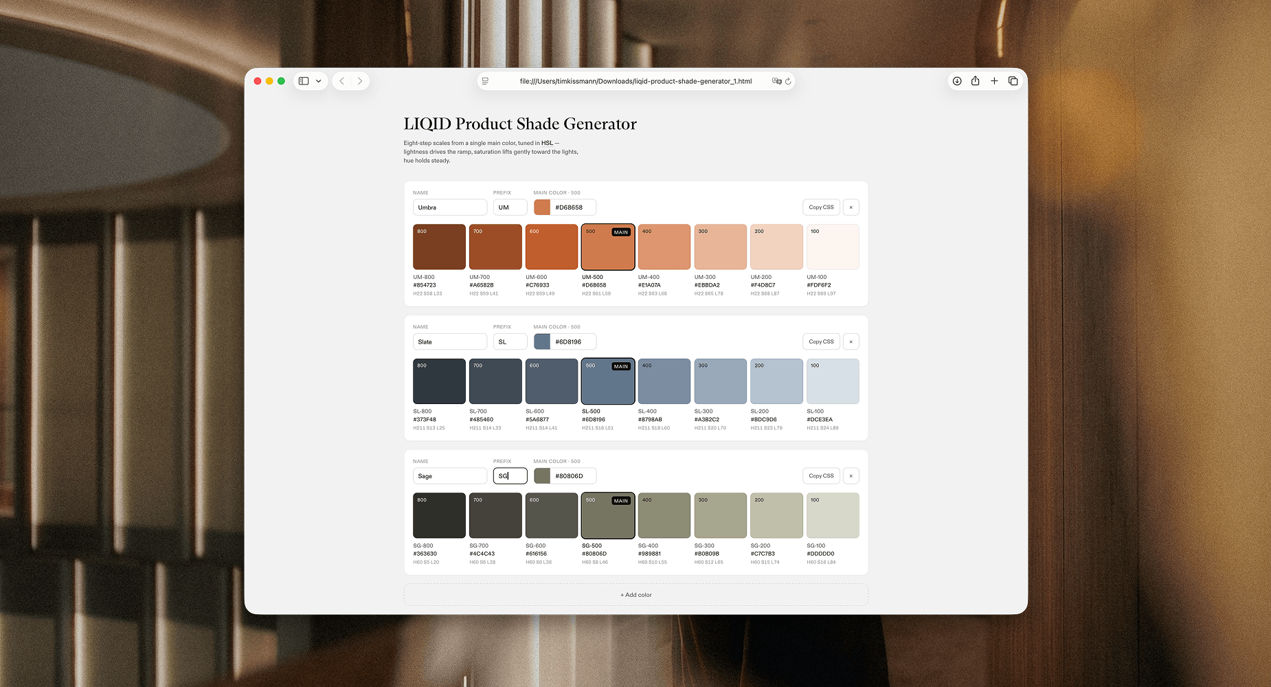
The concept gave us brand and product colours, but they needed work to become a usable system. I named the brand colours and refined their values for clean reproduction in both digital and print, while keeping the approved look intact. The four product colours needed more range: charts and pie charts call for around eight shades per product, so I extended each scale and resolved an overlap where two related products, Private Markets and its entry-level version NXT, shared a colour world.

To work faster, I built a small tool that generates shade scales from a single mid-tone, which let me explore options and keep an overview across all four products at once. From there I fine-tuned individual shades by hand until the steps in lightness and saturation felt right and stayed consistent across every scale. The result is one coherent, extendable colour system across the whole brand.

Toolkit and imagery

Beyond colour, I refined how the brand came together on screen. Where some website modules stacked graphics and type over full-bleed photography, I proposed abstract colour fields under a product-colour overlay, which made the layouts calmer and more premium. I rebuilt the infographic background gradient natively in Figma so it could scale and adopt any product colour, and built the glass-style infographics on top of it.

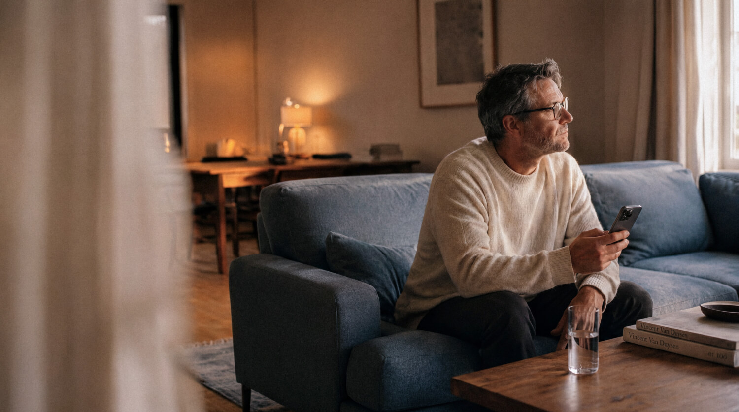
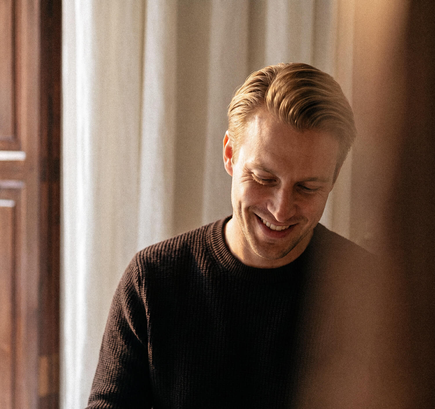
For photography, I set up a repeatable AI pipeline to create a consistent, owned image world of people and mockups, replacing licensed stock across the site: defining the look, letting the model draft prompts from references, then generating and finishing each image by hand.

The outcome

The work turned a broad brand direction into a coherent, production-ready system: a full colour architecture, a scalable visual toolkit and an owned image world, ready to carry LIQID across web, product and communication.

Back to

all projects

TIM KISSMANNVISUAL DESIGNERBERLIN, GERMANY

Copyright © 2026 Tim Kissmann

AI-Assisted Production

Art Direction

Brand System

Color System

Case Study

©2026

In-house Visual Designer

Berlin, Germany

Website

liqid.de

Liqid ↔ 2026 Rebrand ↔ Turning a rough concept into a system that holds.

About this project

LIQID's 2026 rebrand set out to make the brand feel more digital, elegant and premium. It began with an external agency, who delivered the overall direction: a brand concept, a set of guidelines and the foundations of a new website. From there, the in-house design team took it into production, and turning that direction into a system that worked across every format was where I came in. The colour system, the visual toolkit and the site imagery were the parts I owned.
The colour system

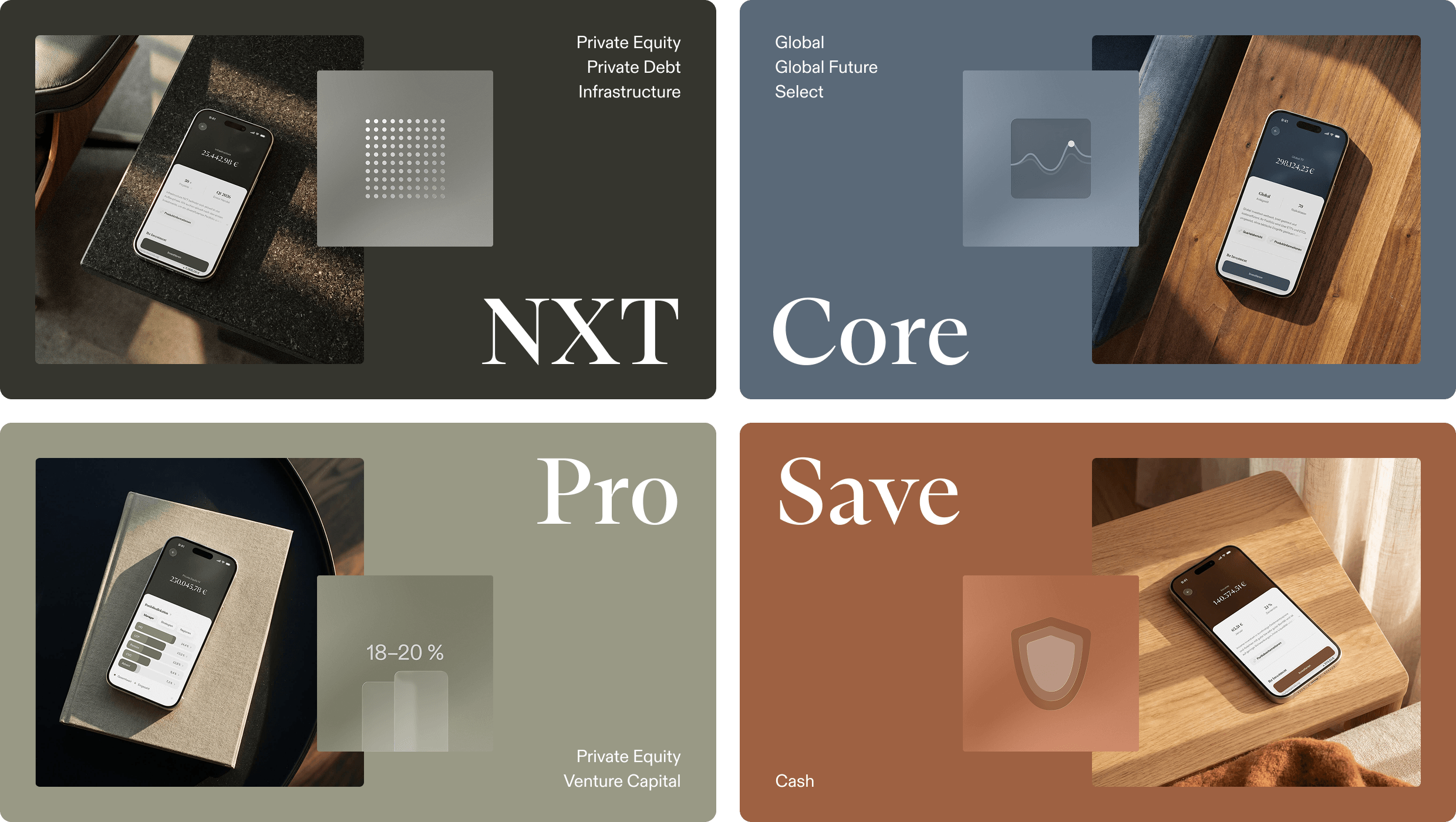
The concept gave us brand and product colours, but they needed work to become a usable system. I named the brand colours and refined their values for clean reproduction in both digital and print, while keeping the approved look intact. The four product colours needed more range: charts and pie charts call for around eight shades per product, so I extended each scale and resolved an overlap where two related products, Private Markets and its entry-level version NXT, shared a colour world.

To work faster, I built a small tool that generates shade scales from a single mid-tone, which let me explore options and keep an overview across all four products at once. From there I fine-tuned individual shades by hand until the steps in lightness and saturation felt right and stayed consistent across every scale. The result is one coherent, extendable colour system across the whole brand.

Toolkit and imagery

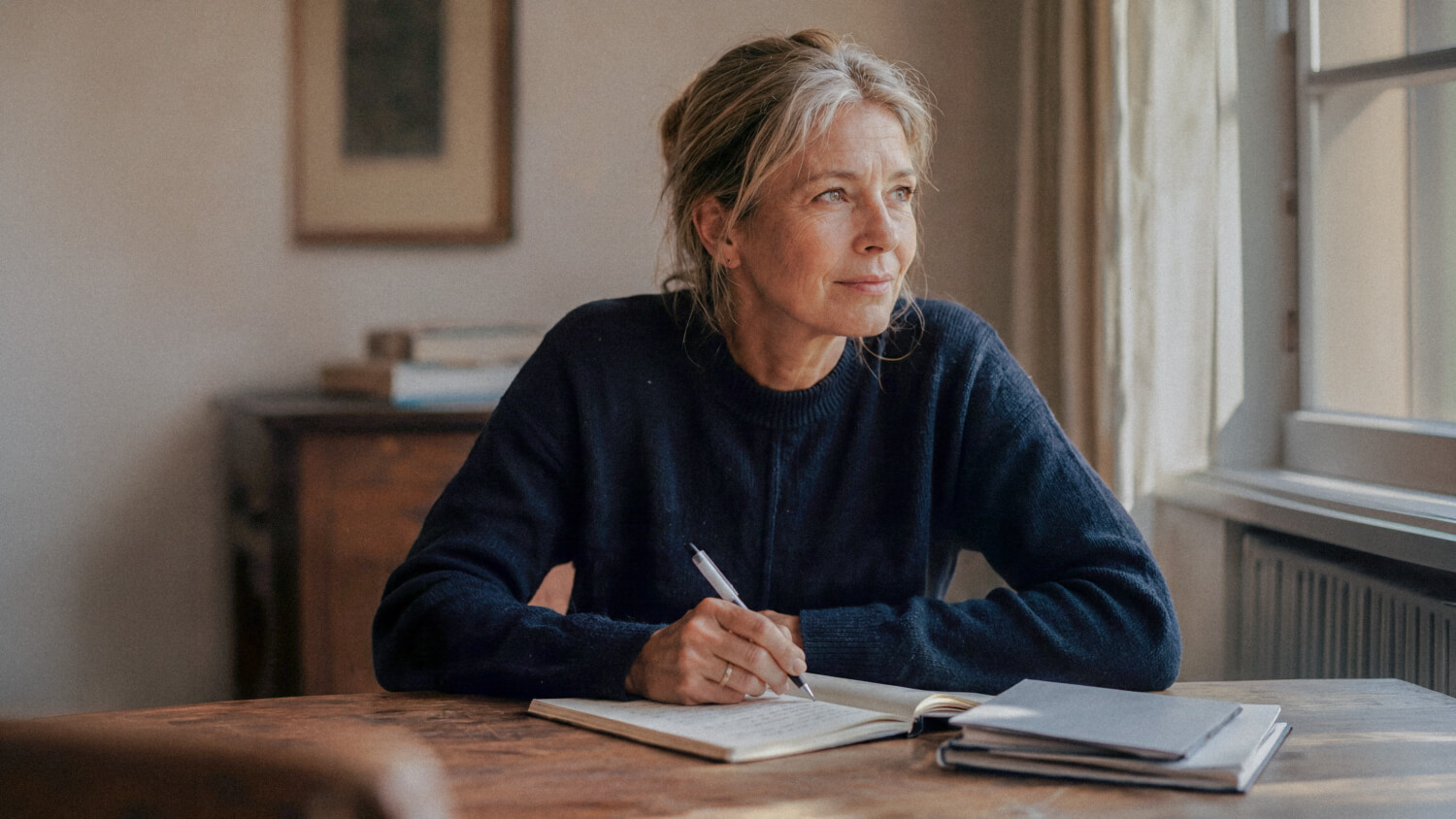
Beyond colour, I refined how the brand came together on screen. Where some website modules stacked graphics and type over full-bleed photography, I proposed abstract colour fields under a product-colour overlay, which made the layouts calmer and more premium. I rebuilt the infographic background gradient natively in Figma so it could scale and adopt any product colour, and built the glass-style infographics on top of it.

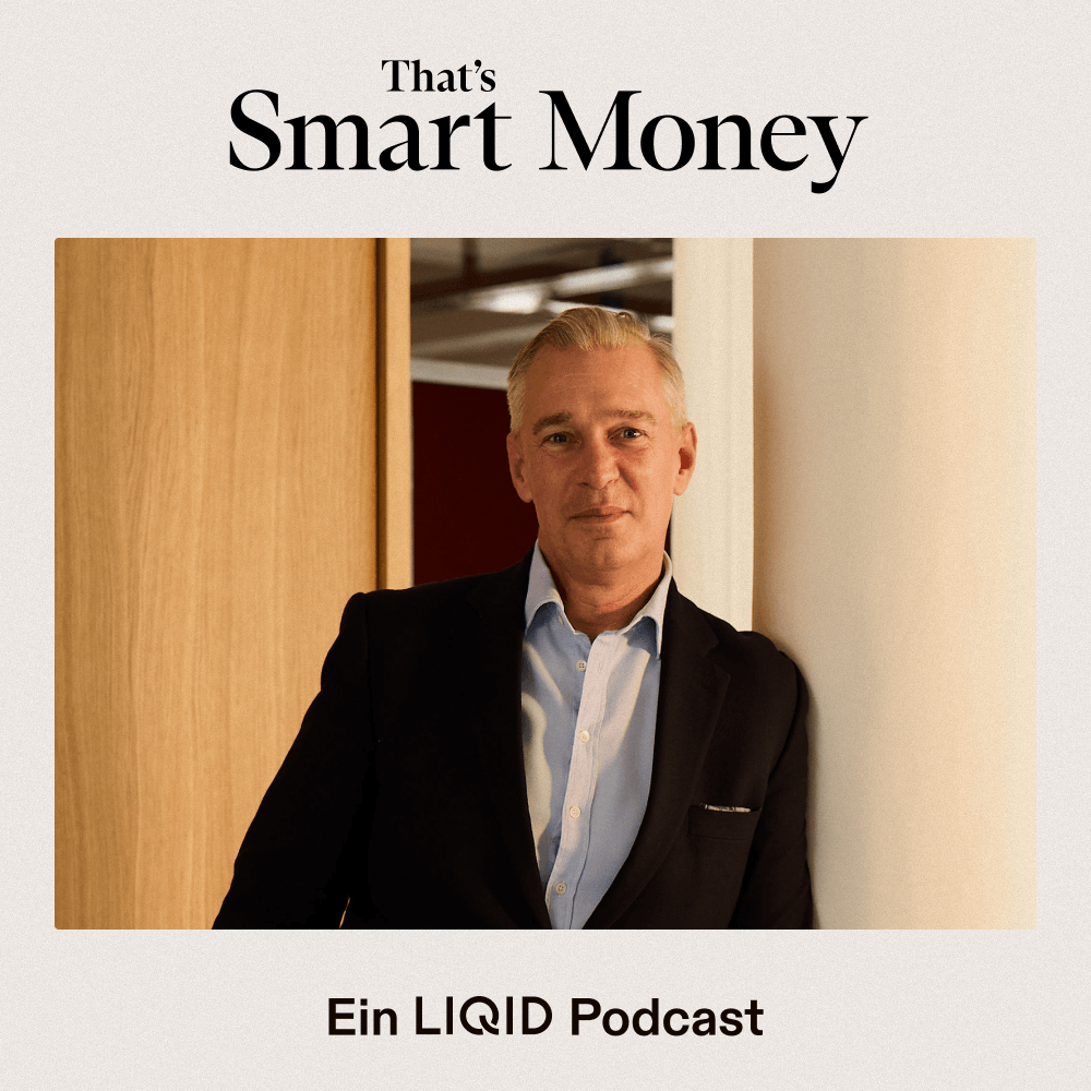
For photography, I set up a repeatable AI pipeline to create a consistent, owned image world of people and mockups, replacing licensed stock across the site: defining the look, letting the model draft prompts from references, then generating and finishing each image by hand.

The outcome

The work turned a broad brand direction into a coherent, production-ready system: a full colour architecture, a scalable visual toolkit and an owned image world, ready to carry LIQID across web, product and communication.

Back to

all projects

TIM KISSMANNVISUAL DESIGNERBERLIN, GERMANY

Copyright © 2026 Tim Kissmann

AI-Assisted Production

Art Direction

Brand System

Colour System

Case Study

©2026

In-house Visual Designer

Berlin, Germany

Website

liqid.de

Liqid ↔ 2026 Rebrand ↔ Turning a rough concept into a system that holds.

About this project

LIQID's 2026 rebrand set out to make the brand feel more digital, elegant and premium. It began with an external agency, who delivered the overall direction: a brand concept, a set of guidelines and the foundations of a new website. From there, the in-house design team took it into production, and turning that direction into a system that worked across every format was where I came in. The colour system, the visual toolkit and the site imagery were the parts I owned.

The colour system

The concept gave us brand and product colours, but they needed work to become a usable system. I named the brand colours and refined their values for clean reproduction in both digital and print, while keeping the approved look intact. The four product colours needed more range: charts and pie charts call for around eight shades per product, so I extended each scale and resolved an overlap where two related products, Private Markets and its entry-level version NXT, shared a colour world.

To work faster, I built a small tool that generates shade scales from a single mid-tone, which let me explore options and keep an overview across all four products at once. From there I fine-tuned individual shades by hand until the steps in lightness and saturation felt right and stayed consistent across every scale. The result is one coherent, extendable colour system across the whole brand.
Toolkit and imagery

Beyond colour, I refined how the brand came together on screen. Where some website modules stacked graphics and type over full-bleed photography, I proposed abstract colour fields under a product-colour overlay, which made the layouts calmer and more premium. I rebuilt the infographic background gradient natively in Figma so it could scale and adopt any product colour, and built the glass-style infographics on top of it.

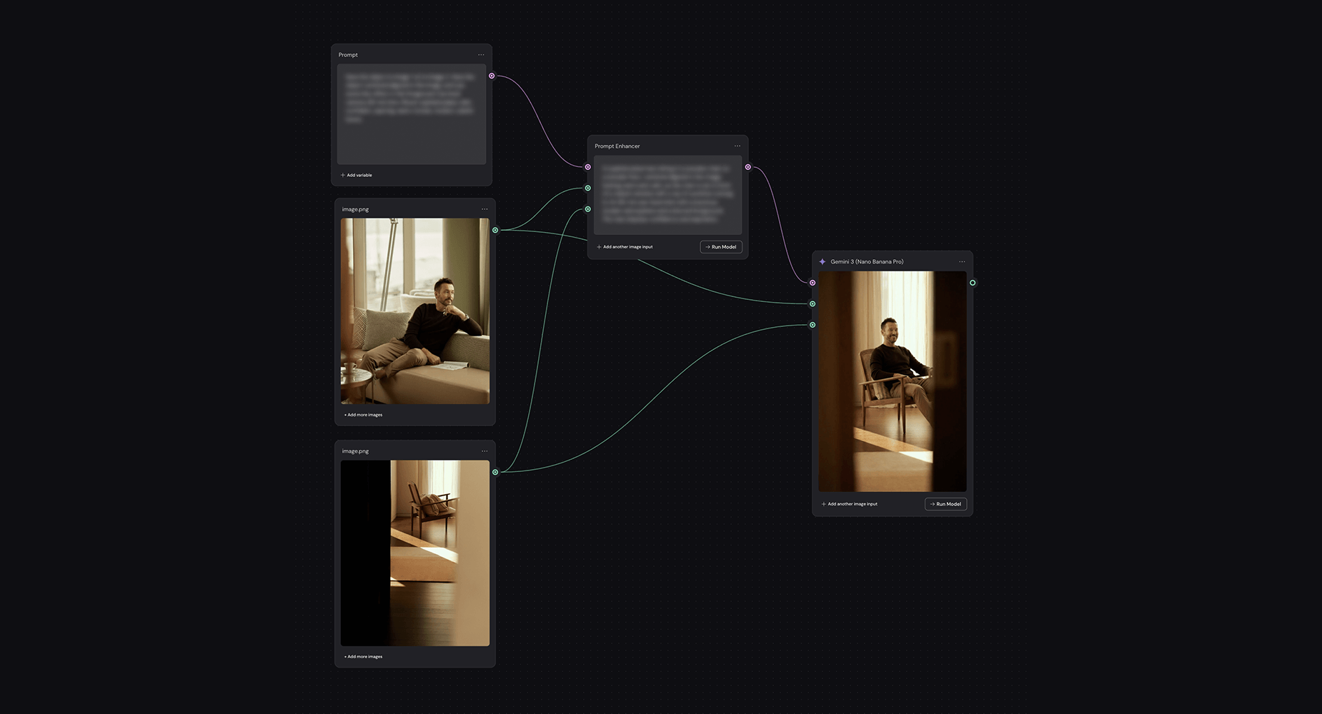
For photography, I set up a repeatable AI pipeline to create a consistent, owned image world of people and mockups, replacing licensed stock across the site: defining the look, letting the model draft prompts from references, then generating and finishing each image by hand.

The outcome

The work turned a broad brand direction into a coherent, production-ready system: a full colour architecture, a scalable visual toolkit and an owned image world, ready to carry LIQID across web, product and communication.

Back to

all projects

TIM KISSMANNVISUAL DESIGNERBERLIN, GERMANY

Copyright © 2026 Tim Kissmann