Case Study
Brand System
Color
Brand Guidelines
Art Direction
©2024
In-house Visual Designer
Berlin, Germany
Website
liqid.de
Liqid ↔ 2024 Brand Refresh ↔ A refresh built for distinctiveness.
About this project
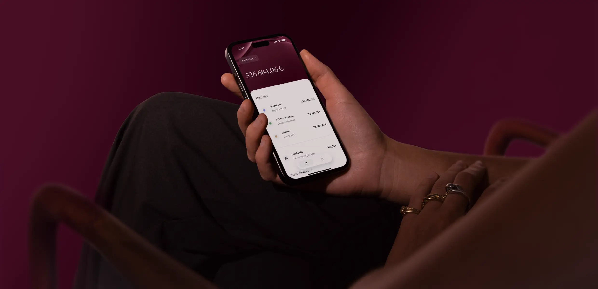
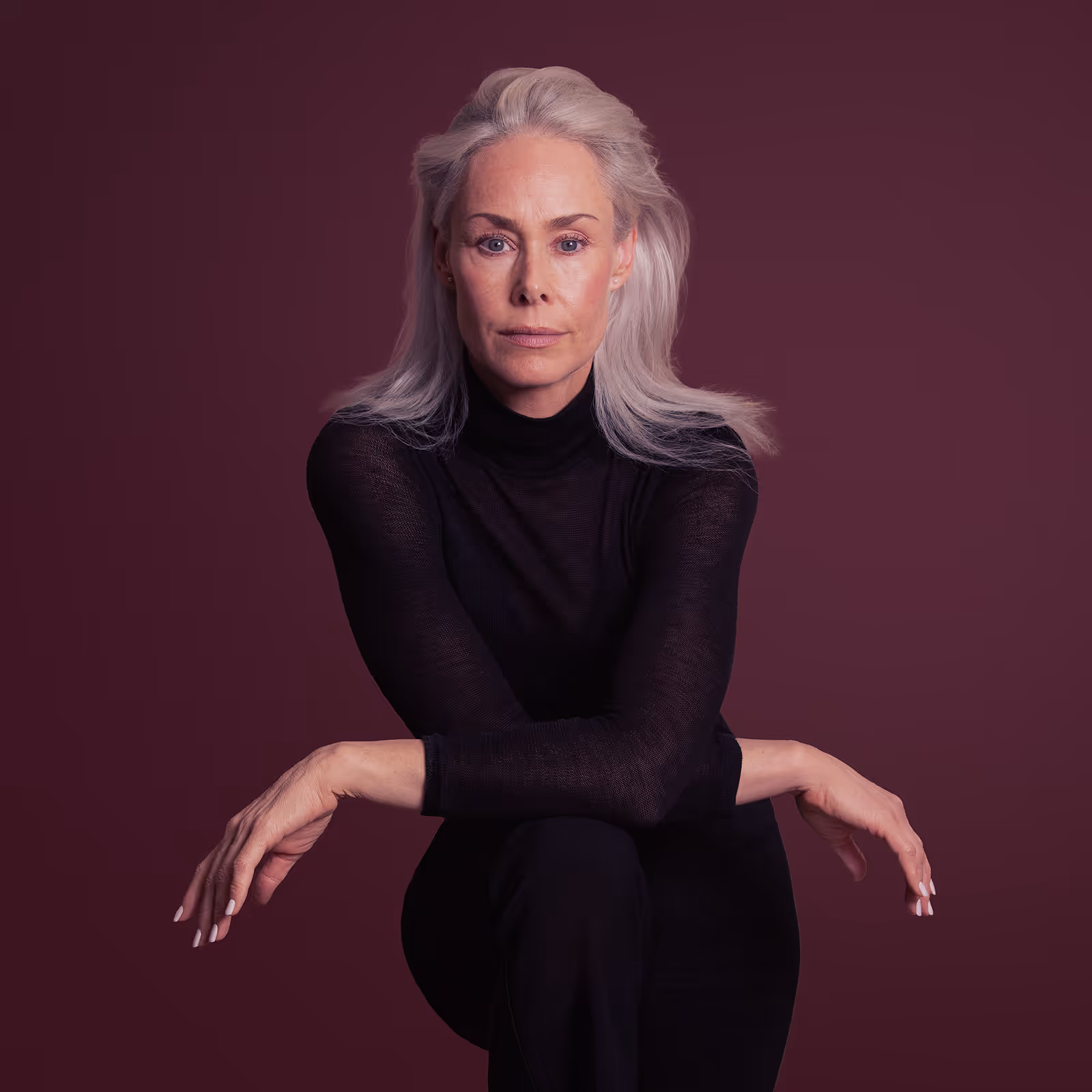
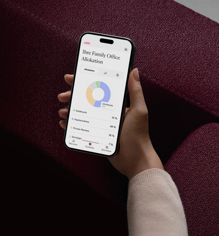
The 2024 refresh had one goal: distinctiveness. LIQID's marketing had leaned on a neutral beige for backgrounds, a colour that's hard to own and easy to mistake for any other brand. The refresh answered that with a strong new secondary colour, Mahogany, that gave LIQID a look of its own.
My role
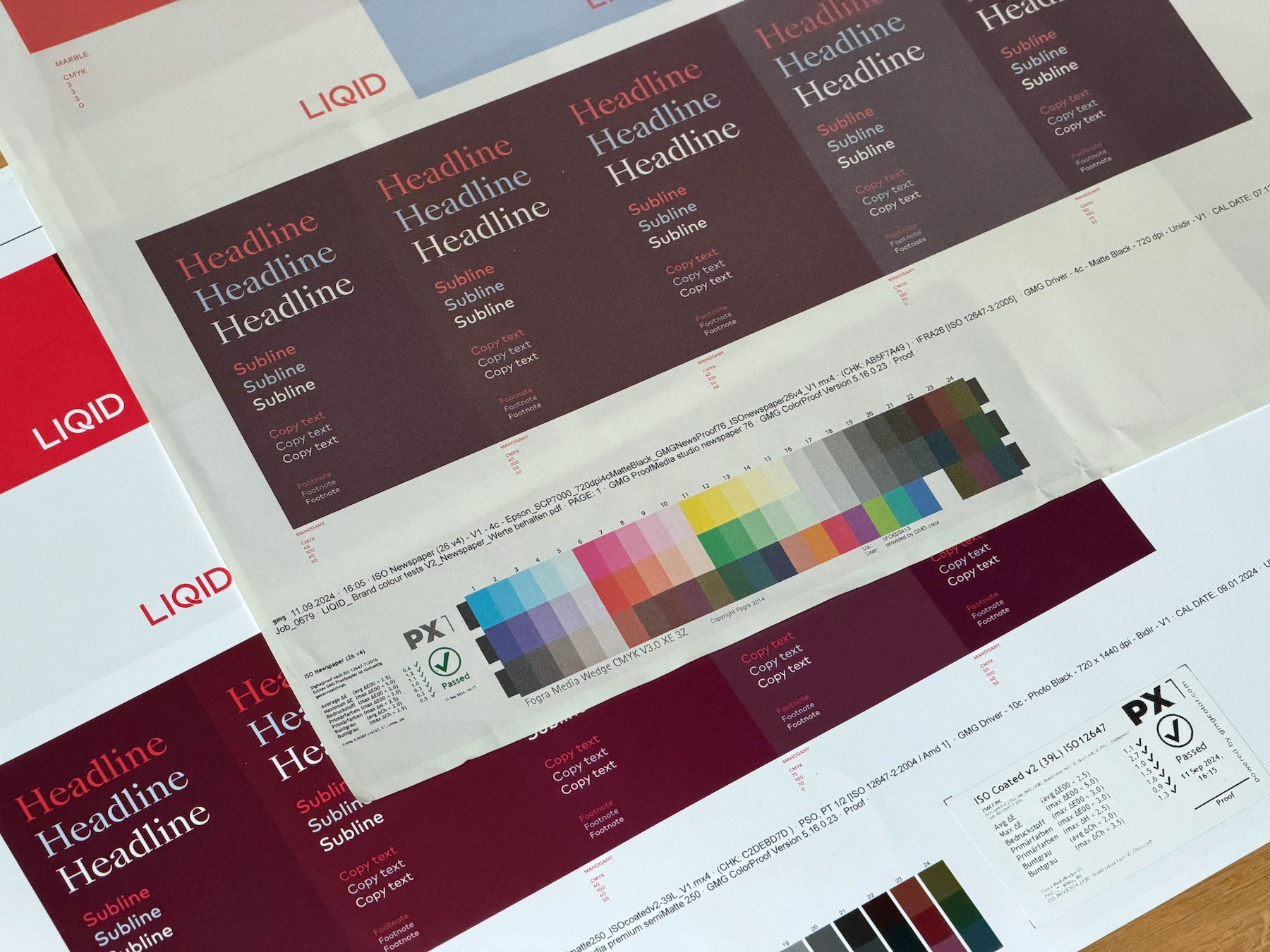
I worked on the colour alongside the senior designer. I explored and tested concepts, and once the direction was set, I worked through the shades in detail across digital and print, with test prints to check it held up on paper as well as on screen.
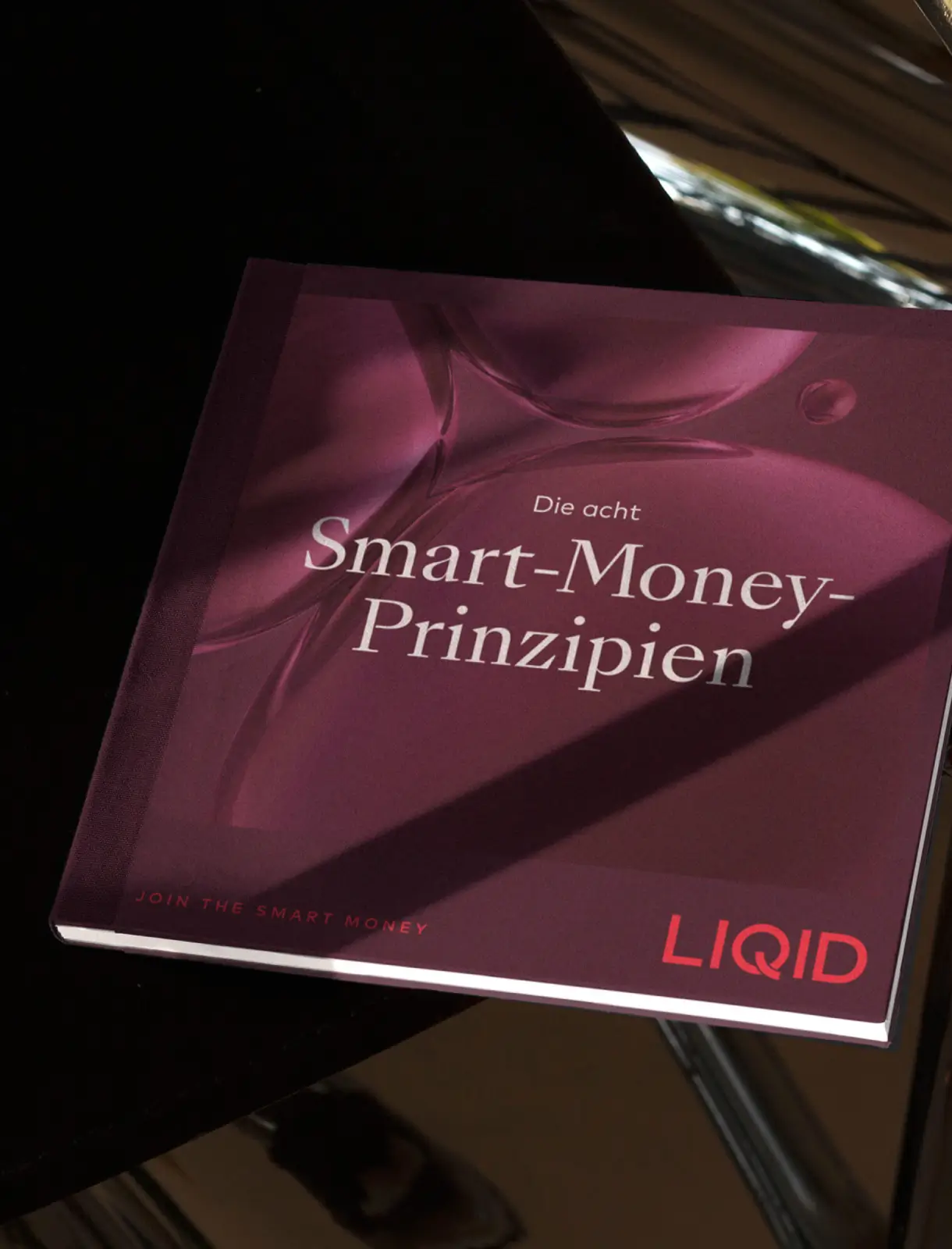
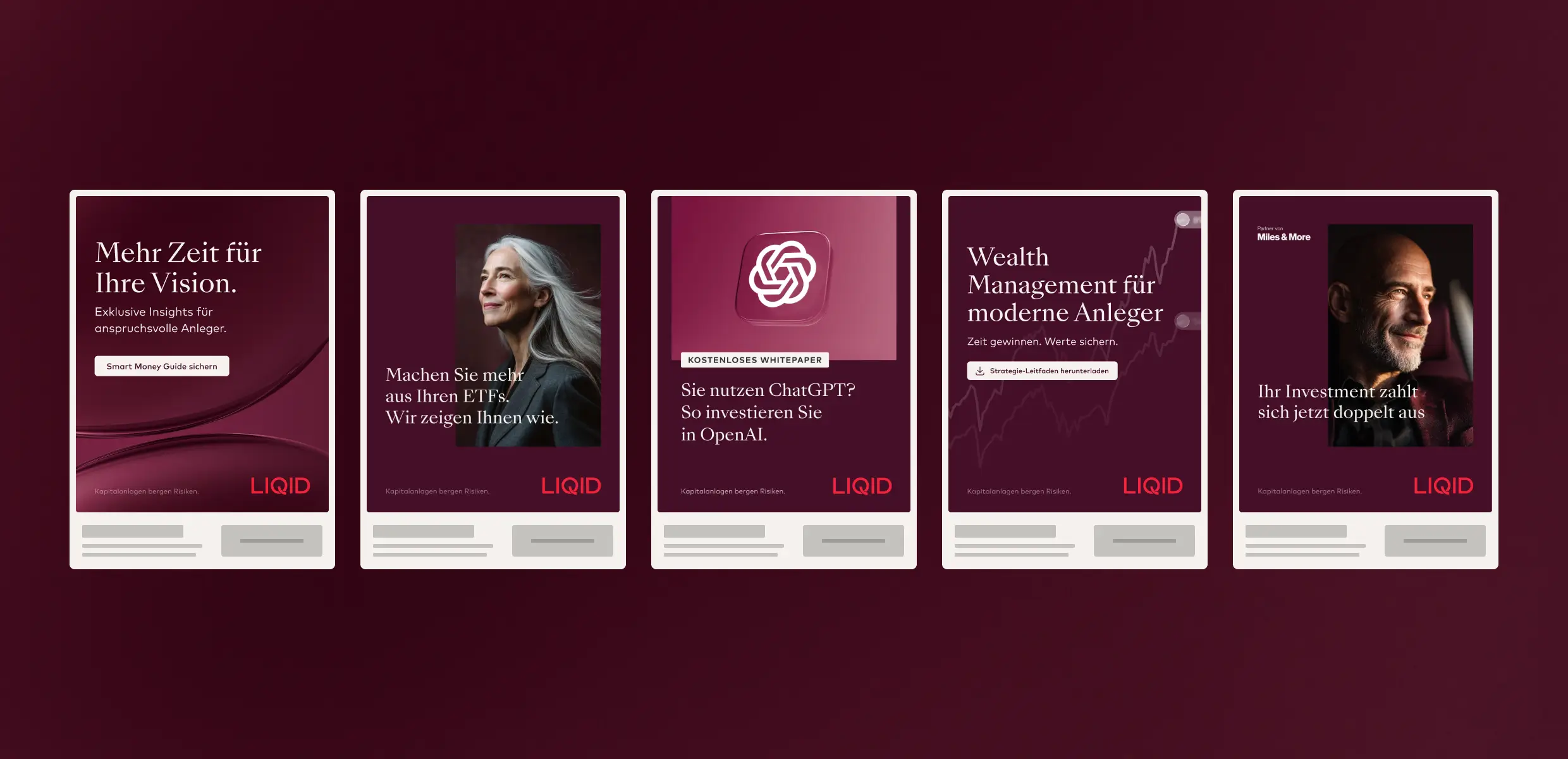
Alongside that I wrote the brand book, documenting the refreshed system and closing the gaps it still had. Then came the daily work of living with a refresh: producing new assets in the new look and migrating existing ones, long booklets included, so the whole library came across.
The outcome
The refresh gave LIQID a distinctive, ownable look, and it lasted. Mahogany still anchors the brand today. When the 2026 rebrand came, the colour was only lightly adjusted and the look stayed. For a design decision to survive the next rebrand is about the clearest proof it was the right one.